CRO to Tailwind

overview
Every Tinuiti partner landing page used to be rebuilt from scratch. I designed and built a design system that fixes this where it starts: a Figma template on a Tailwind/shadcn foundation, plus a plugin that ships a partner's rebrand to engineering as a PR, with no terminal involved.
the problem
At Tinuiti, each new partner landing page started from a blank file. Modules were hard-coded and rebuilt every time. A rebrand meant reworking the whole page and pulling an engineer off other work. Colors and type drifted between Figma and what shipped. Pages for different partners also looked inconsistent, even when they were meant to follow the same CRO best practices.
what I built
- The 2026 Partnership Template: a Figma file built on a Tailwind/shadcn foundation, made of plug-and-play modules that take a partner's branding through variables instead of custom code.
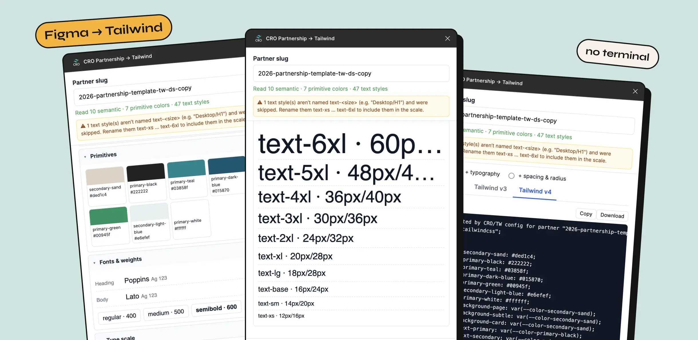
- CRO Partnership → Tailwind: a Figma plugin that reads the template's variables and text styles, previews them, and publishes Tailwind v3 and v4 config to the repo as a pull request.
Pages can now be templatized around proven CRO patterns. A rebrand is a variable change, not a rebuild.
execution
a small token system, on purpose
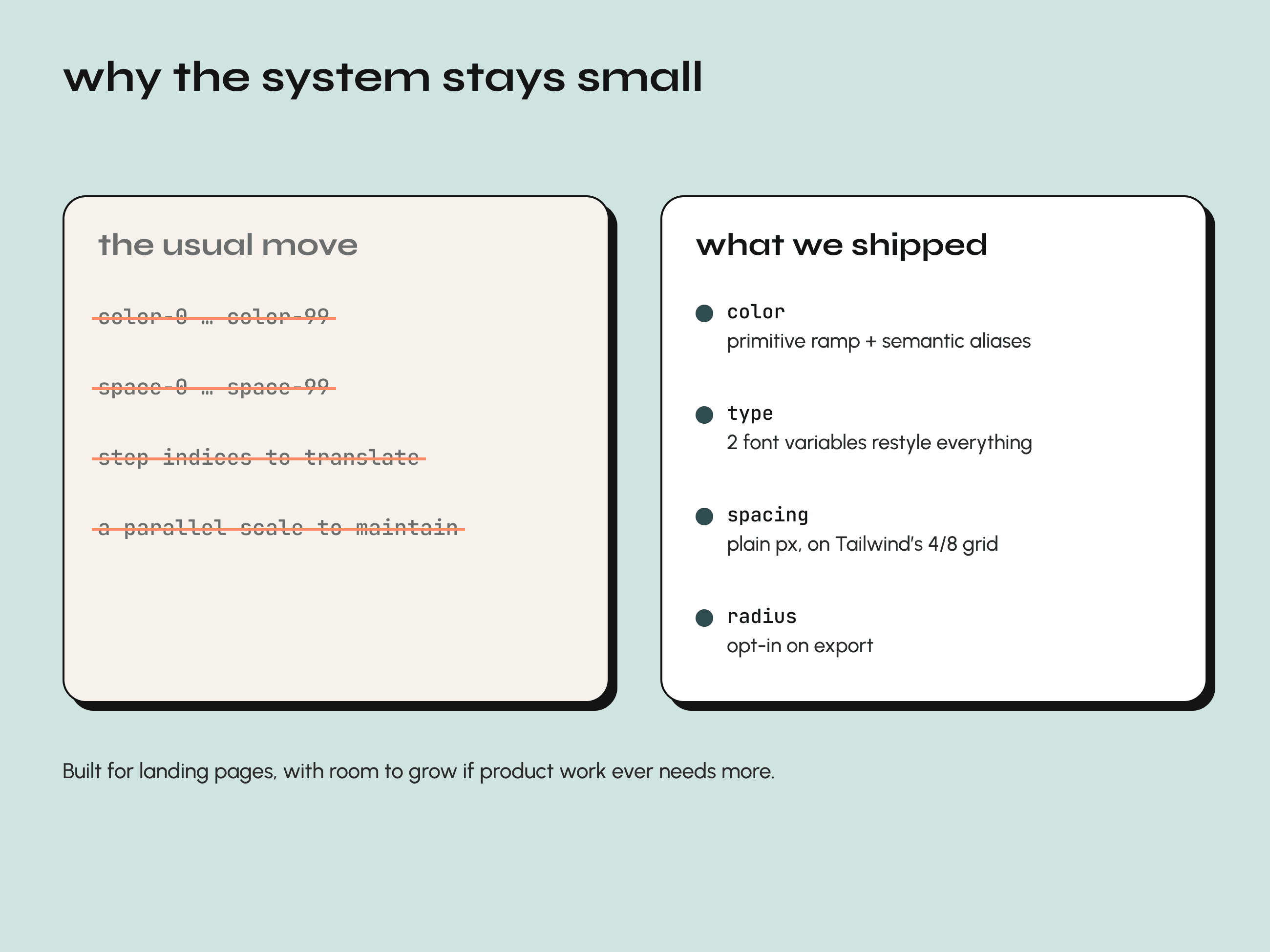
The usual move for a design system is a deep numeric scale, with spacing and color primitives running 0–99. The lead designer and I talked it through and decided against it. Landing pages don't need that much machinery, and Tailwind already enforces a 4/8-point grid through its spacing classes. A parallel scale would just be one more layer for designers to learn and keep in sync.
So tokens live where rebrands actually happen: color and typography.
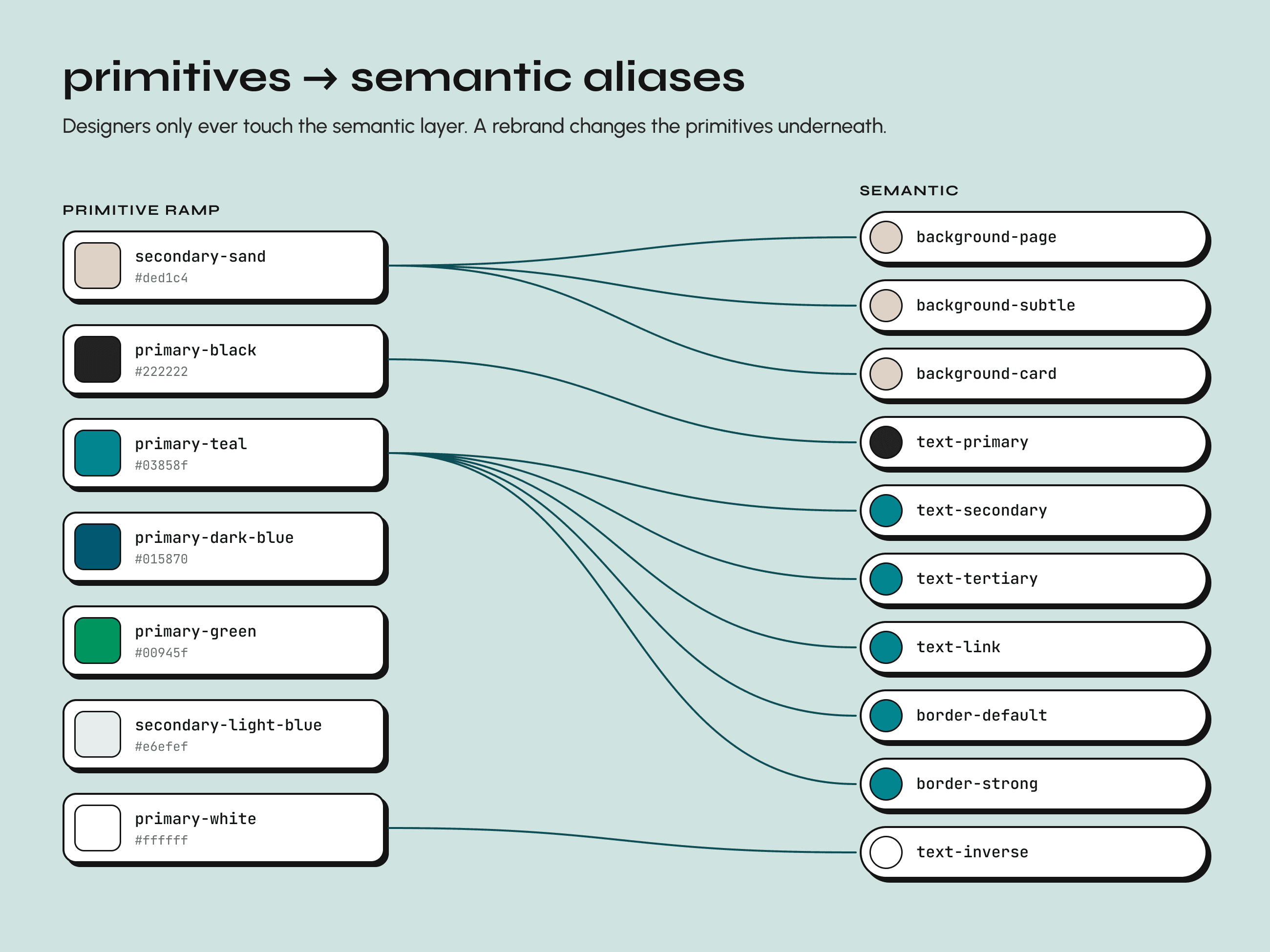
- Brand colors sit in a primitive ramp. Everything a designer touches (background, text, border, brand) is a semantic alias into it.
- Two font variables, heading and body, restyle every text style in the file at once.
- Spacing stays plain. Values map directly to the pixel values engineers already use in Tailwind, so there are no step indices to translate and no off-grid values.
We also scoped it on purpose. Product and app design may justify deeper token layers; landing pages usually don't. The system is built so it can grow if that changes.
a file that explains itself
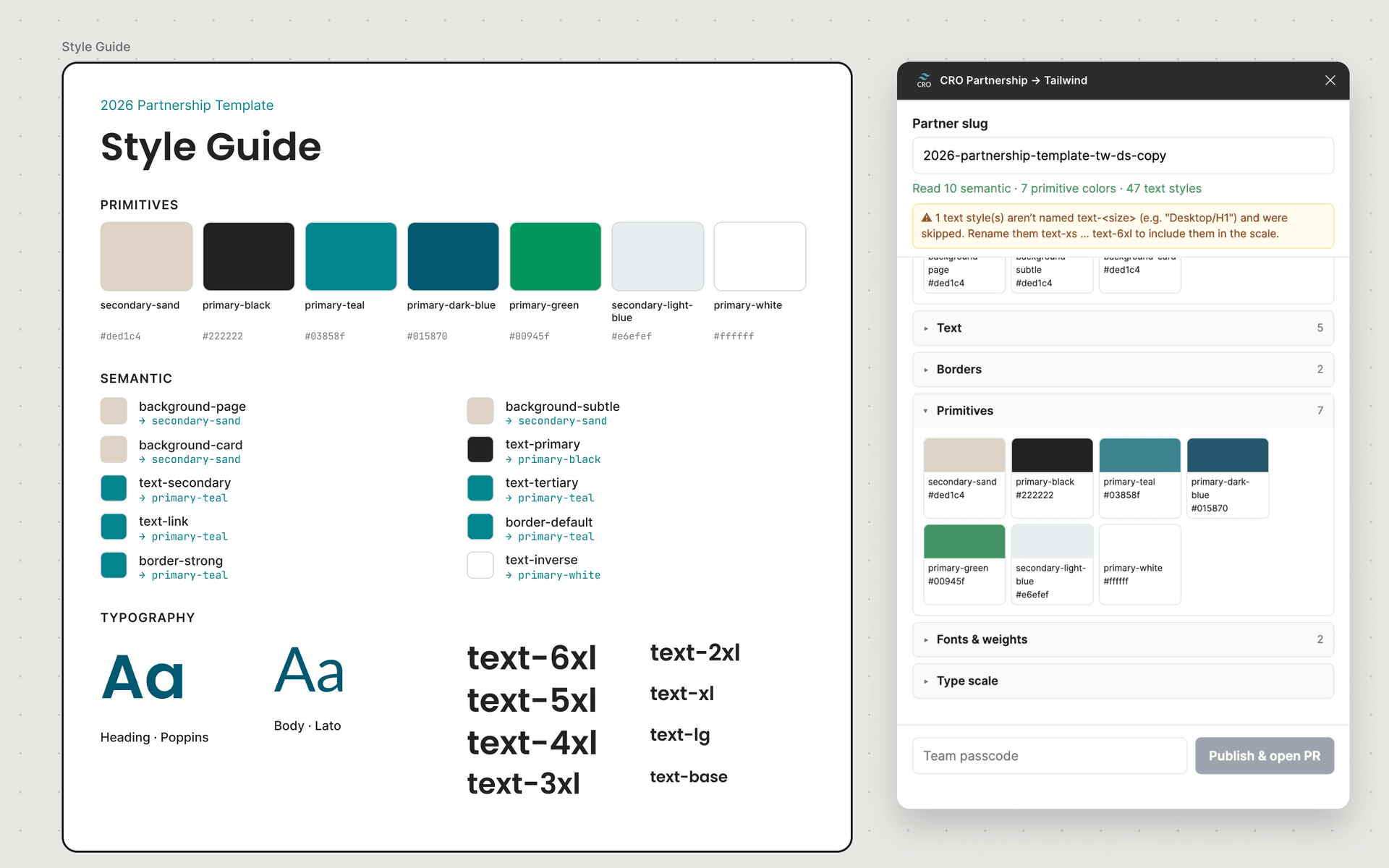
The template's Style Guide walks a designer through every step, with callouts for the parts that usually trip people up, like adding a new token or changing a font. Nobody needs to ask me or an engineer how it works.
the designer workflow, no terminal
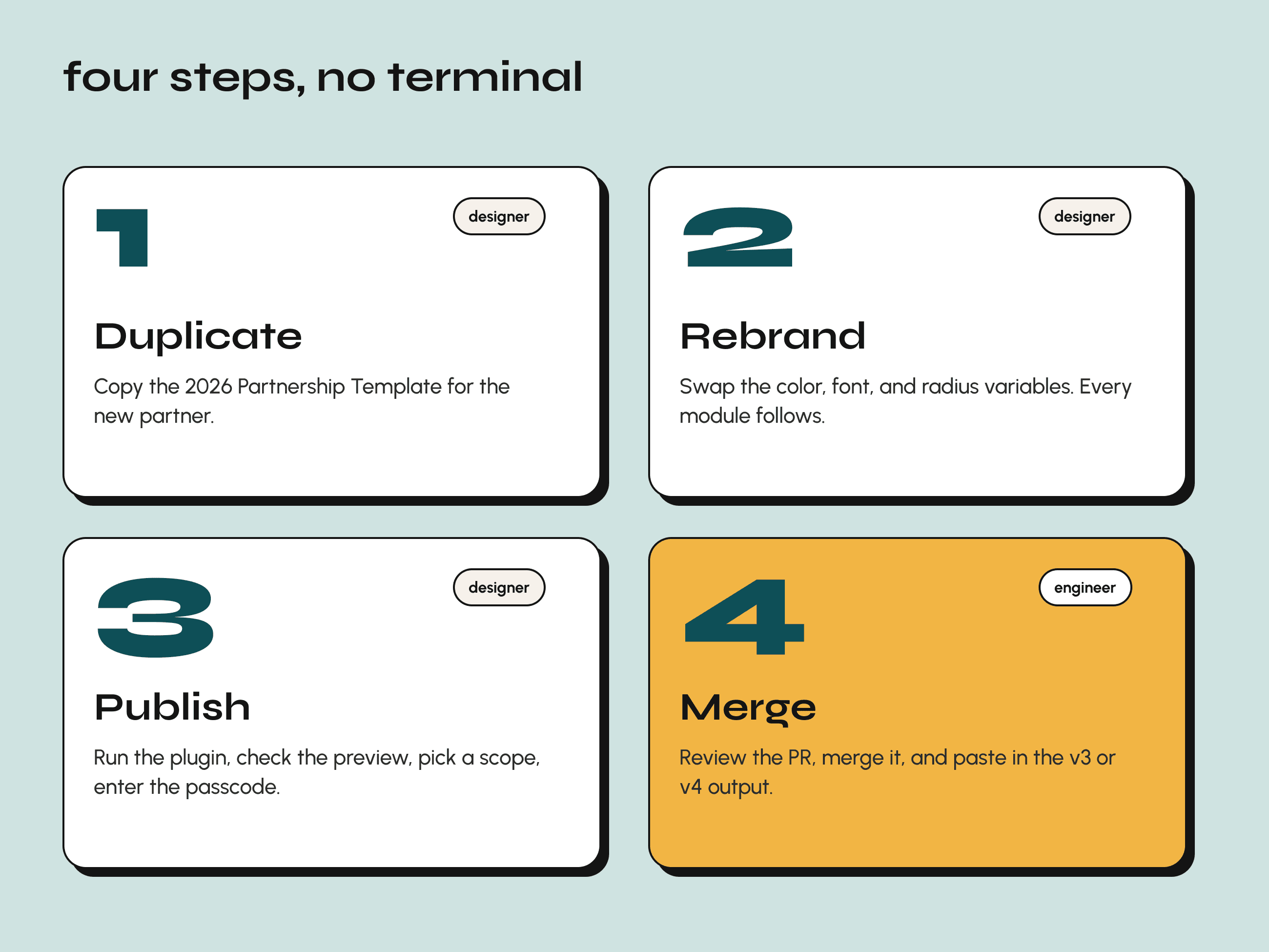
- Duplicate the template for the new partner.
- Rebrand the color, font, and radius variables.
- Run the plugin, check the preview, pick an export scope, and enter the team passcode.
- An engineer reviews and merges the PR, then drops in the Tailwind v3 or v4 output.
Colors and typography export by default. Spacing and radius are opt-in, which keeps the output as lean as the system behind it.
preview before publish
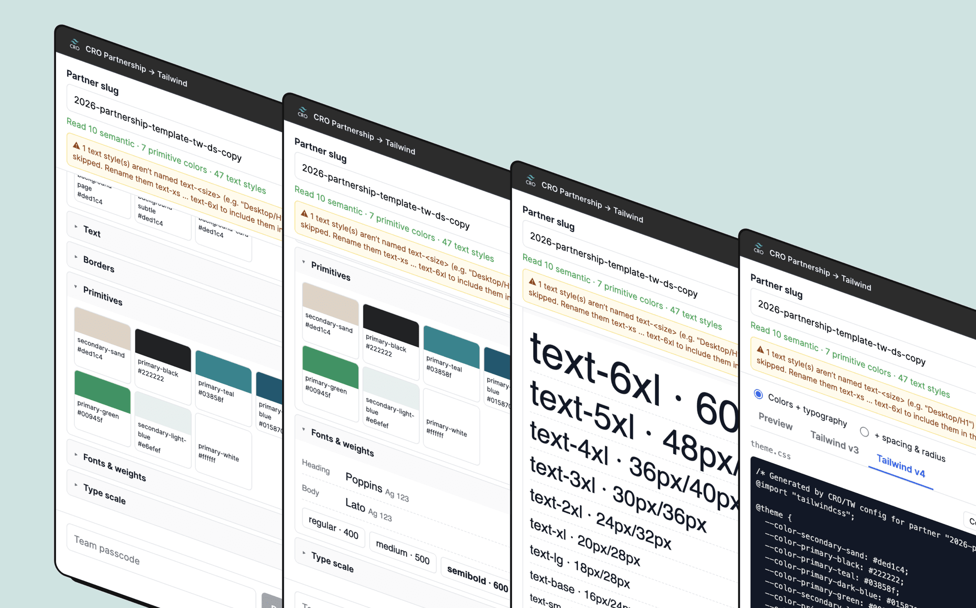
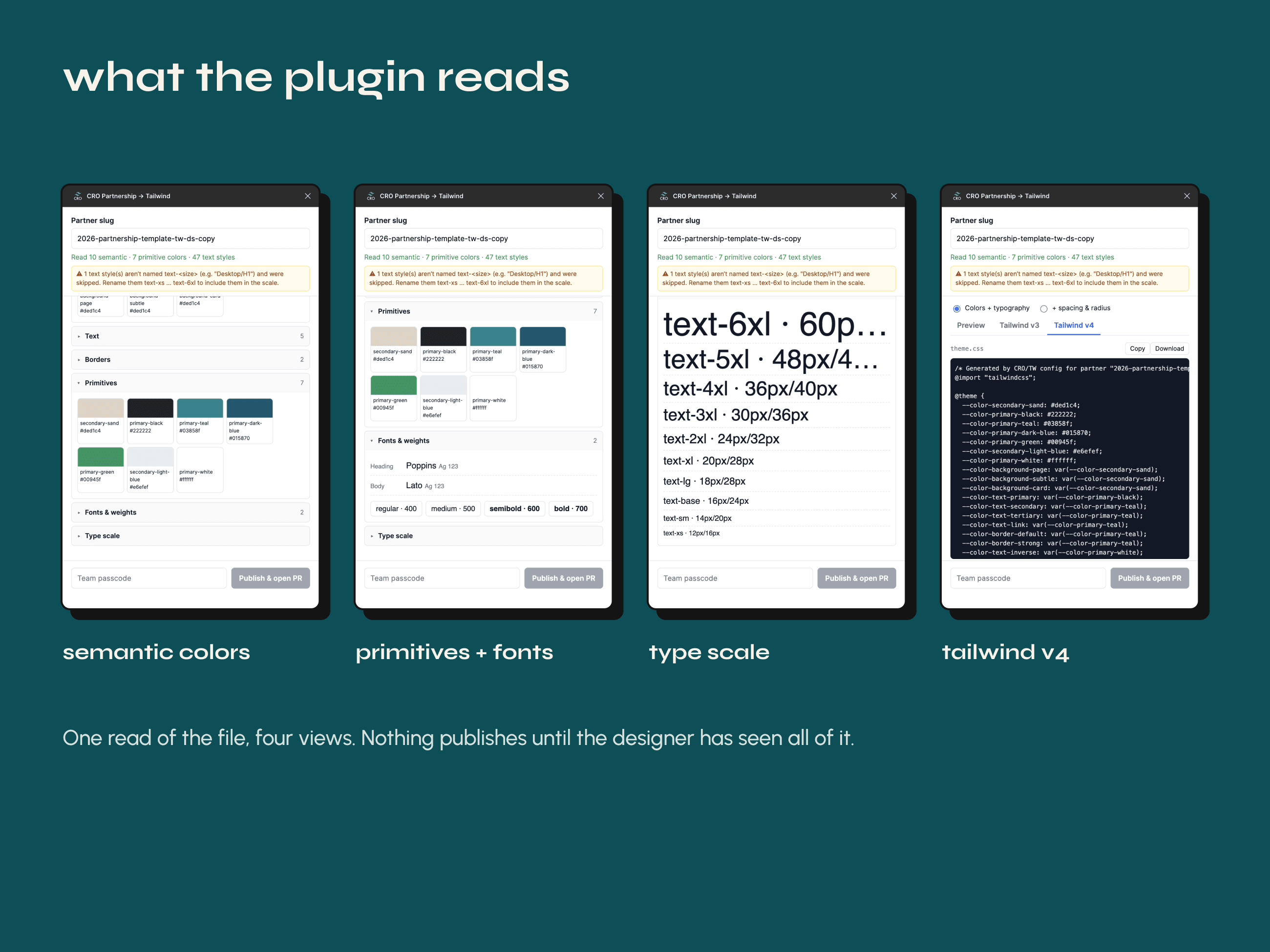
Before anything is published, the plugin reads the file and shows the designer exactly what it found: semantic colors, primitives, fonts and weights, and the type scale. It also catches mistakes early. If a text style doesn't follow the text-<size> naming, the plugin flags it and skips it until it's renamed, so the problem gets fixed in Figma instead of in a PR.
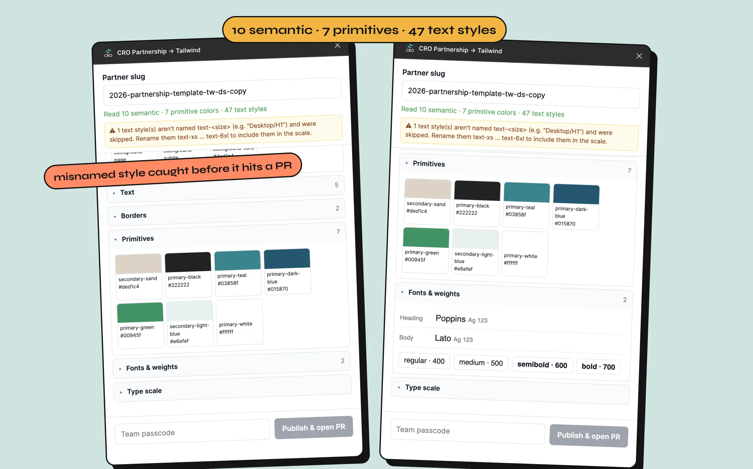
The plugin reads the duplicated template: 10 semantic colors, 7 primitives, and 47 text styles, with one misnamed style flagged before it can reach code.
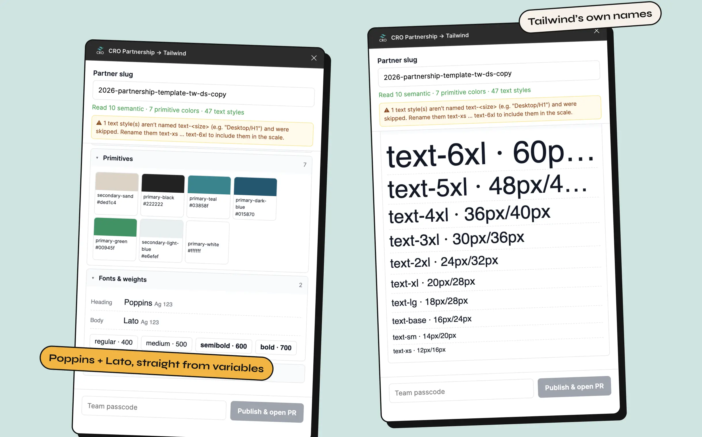
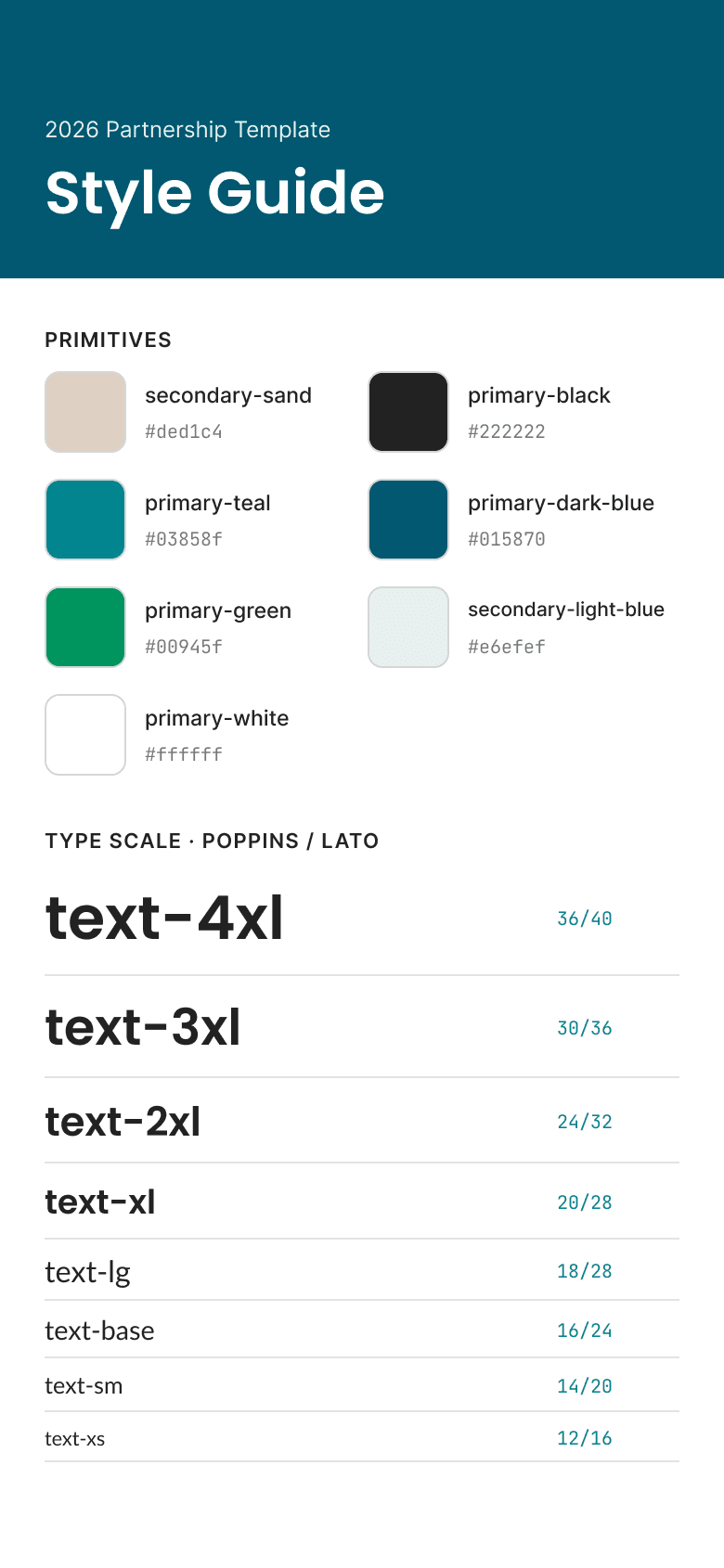
Heading and body fonts and weights come straight from Figma variables. The type scale uses Tailwind's own names, text-xs through text-6xl, so engineers see sizes they already know.
handoff without the tooling overhead
I skipped Tokens Studio and Style Dictionary and wrote a small, dependency-free core instead. It maps Figma's resolved variables to a token model and emits both Tailwind v3 and v4 config. The Figma file that holds the partnership templates becomes the single source of truth for what gets built in code.
Designers never hold a GitHub credential. They type a team passcode, and a small Lambda checks it before firing a repository_dispatch to the repo. A GitHub Action commits the config to a partner/<slug> branch and opens a PR. As a side effect, the repo's Pull Requests tab doubles as a running list of partners: open PRs are pending, merged ones are live.
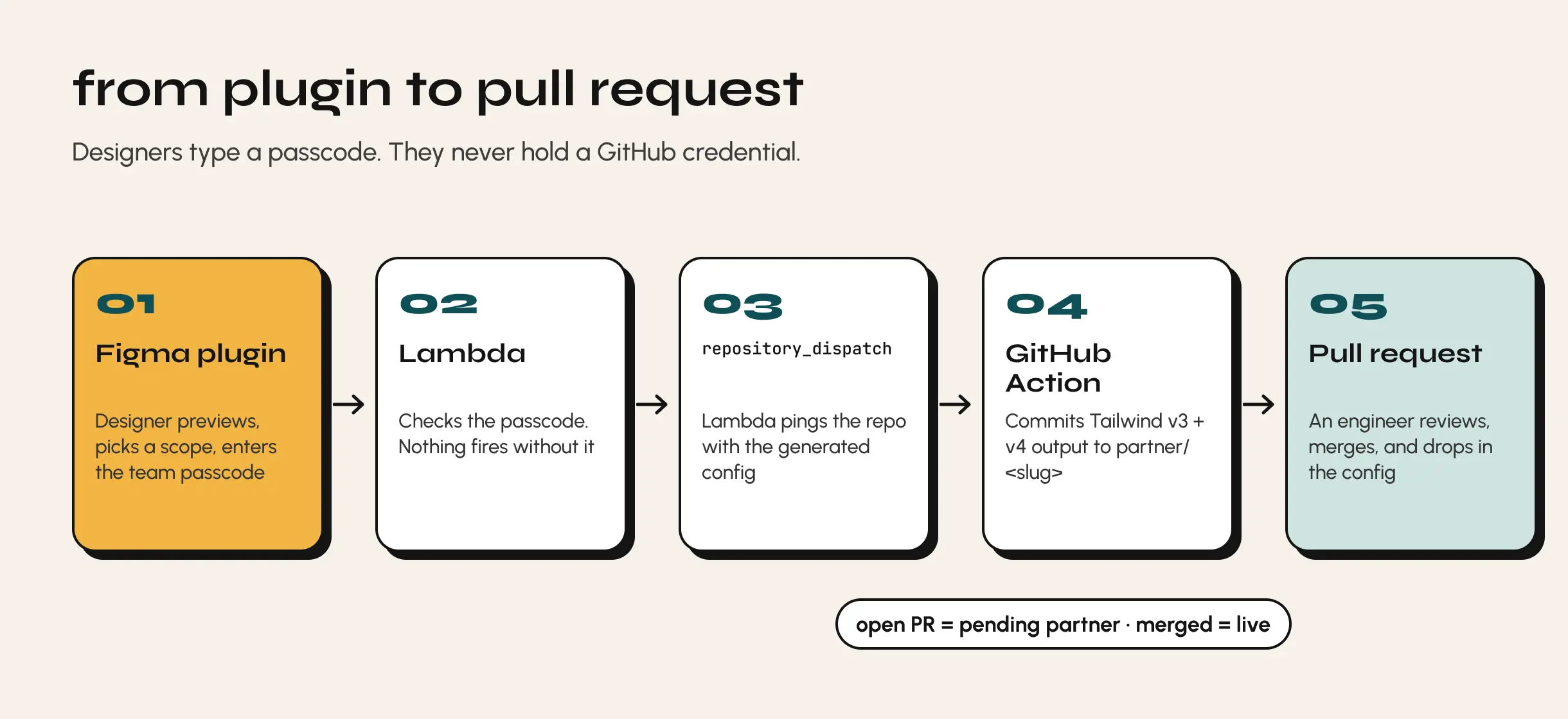
From the plugin to a PR: passcode → Lambda → repository_dispatch → GitHub Action → partner branch and PR.
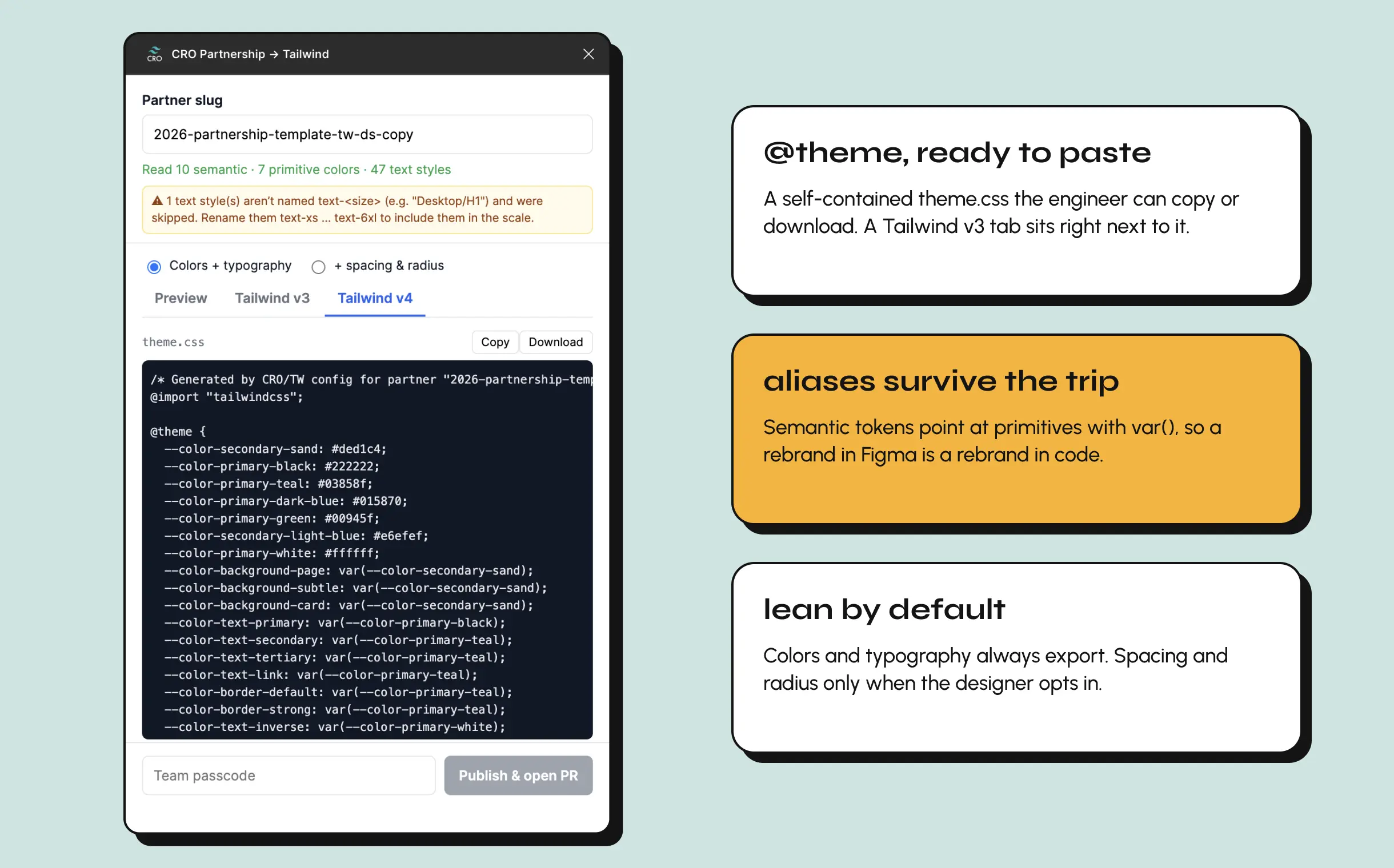
The Tailwind v4 tab: a self-contained @theme block an engineer can copy or download, with semantic tokens aliased to primitives. A v3 tab sits next to it.
proving it on two very different brands
To test the system, we applied it to real collection pages for two partners, a footwear brand and a beauty brand. Both started from the same base template. Each rebrand meant filling in brand colors, remapping the semantic aliases, and swapping the fonts. The layout and cross-sell structure stayed the same. From there, the lead designer quickly built desktop and mobile flows (collection, add to cart, cart) on top of it.
results
The system is being rolled out across the partnership team, and the first two pages already show what it was built for. One template carried two visually different partner brands without rebuilding a single component.
- Less drift. Fewer tokens means fewer places for a partner's page to stray from Figma.
- Less engineering time. Engineers review a PR instead of rebuilding a page.
- One source of truth. The Figma template and the shipped Tailwind config come from the same variables.