Little Spoon CRO

overview
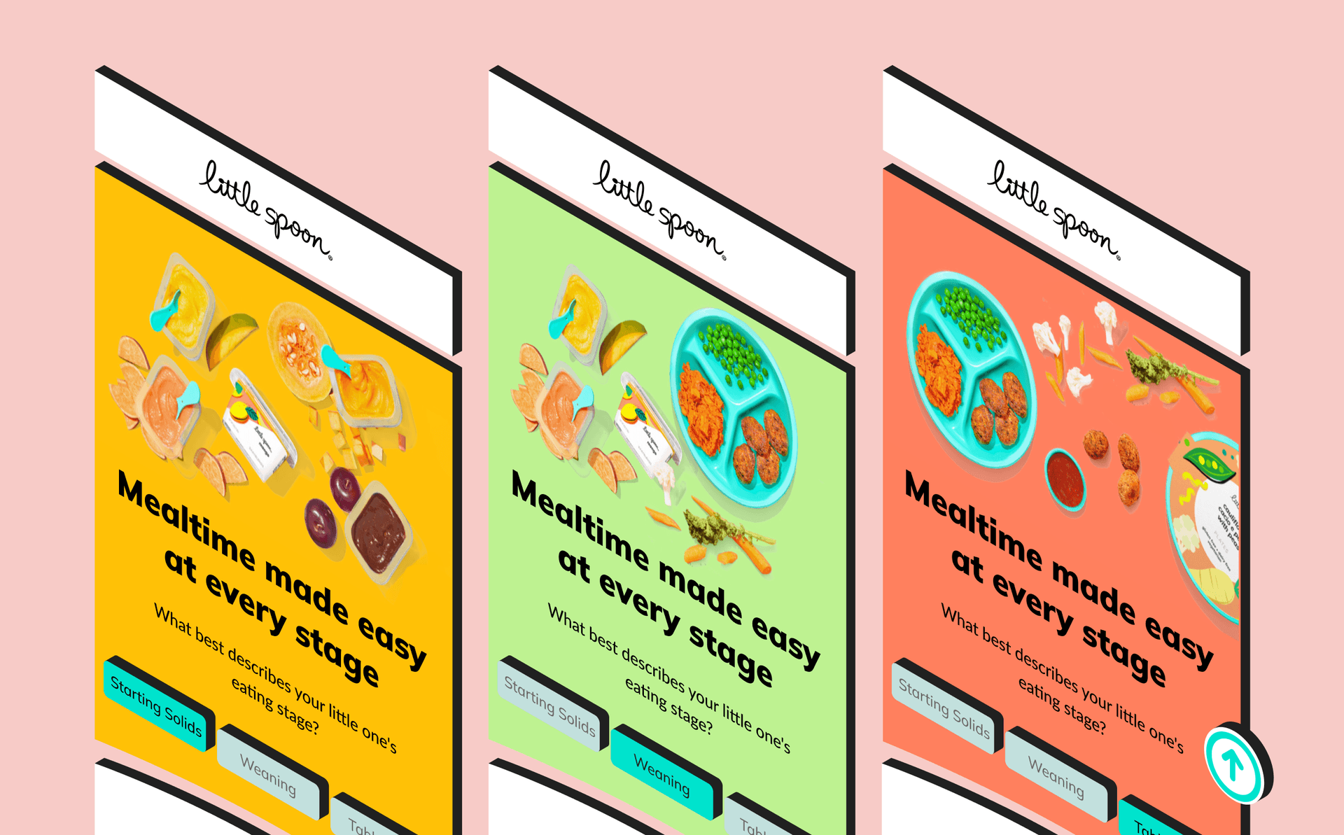
Little Spoon, a children’s food brand, ran separate Meta campaigns to each of their product lines, with traffic landing overwhelmingly on mobile. The split limited cross-selling and did not account for parents with more than one child across different ages. Roughly 20% of conversions were already coming through a product line other than the one the ad campaign pointed at, which suggested users would click an ad for one product and buy another depending on their child’s age.
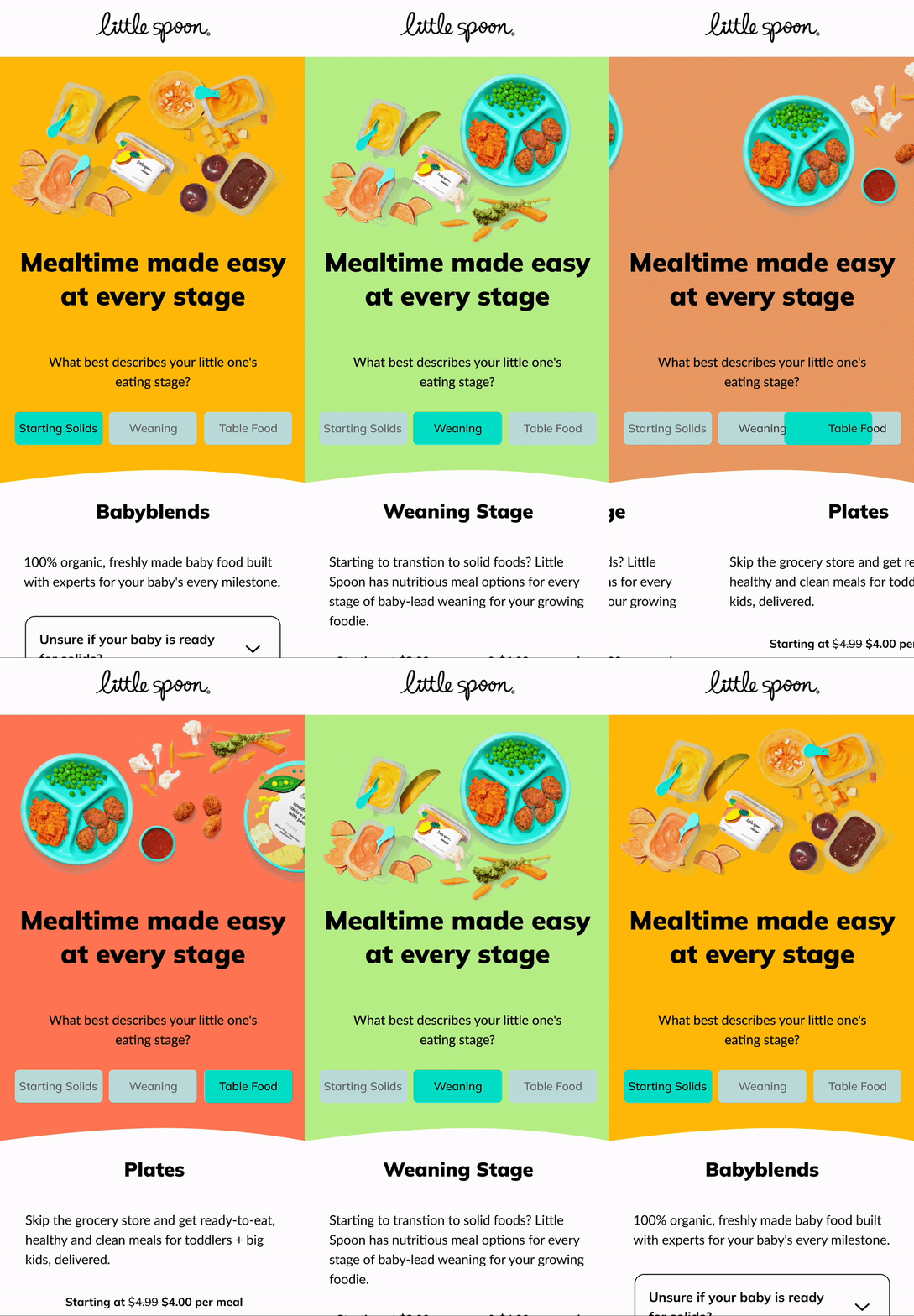
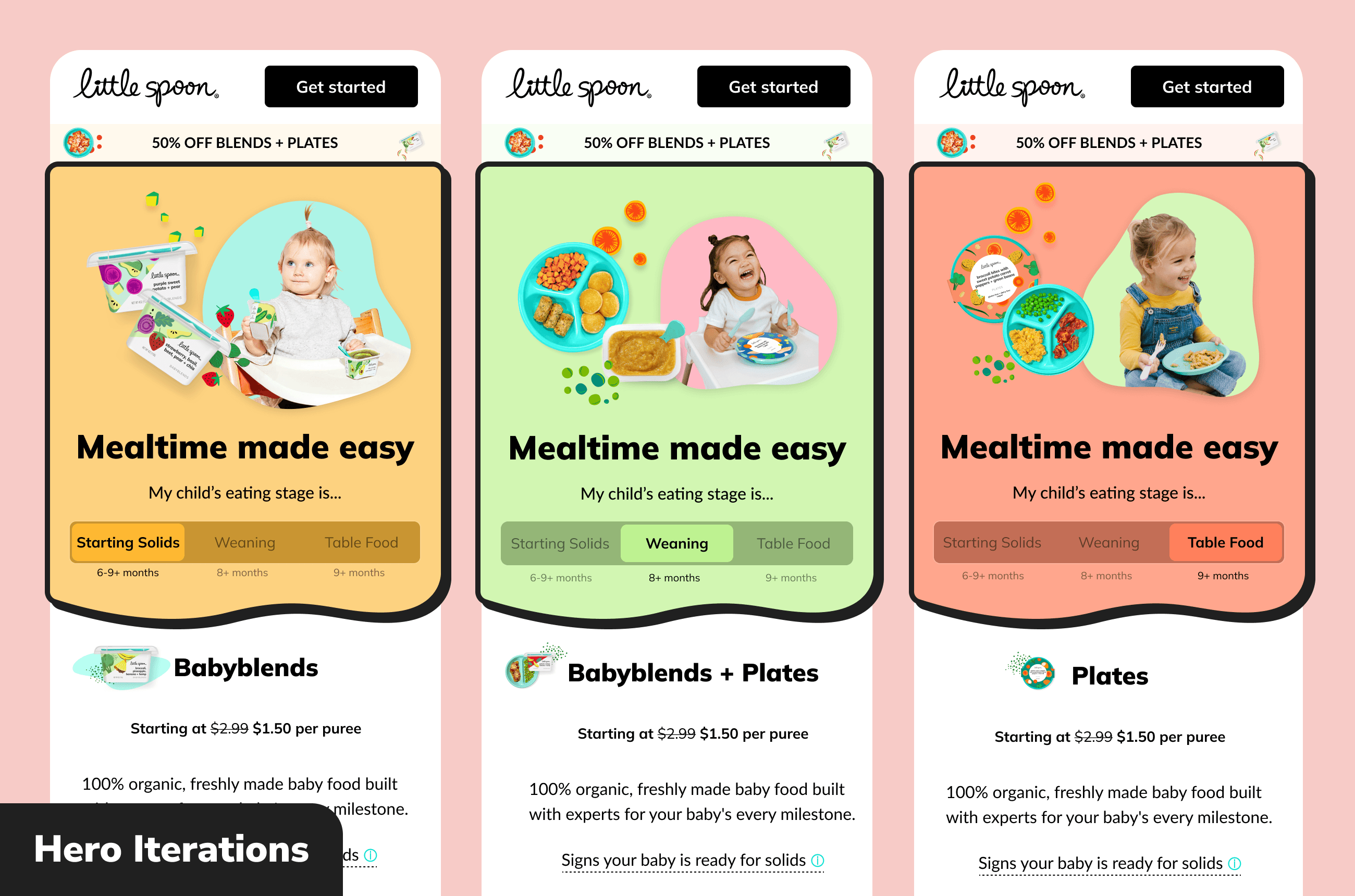
Working from that, I designed and iterated on a landing page that lets users select the option relevant to them, toggling the whole page to direct response content for that product line. After wireframes and mocks, we launched it on Meta against the existing champion — a landing page built around a single product line. It won, and remained the champion for close to a year.
execution
User Interviews
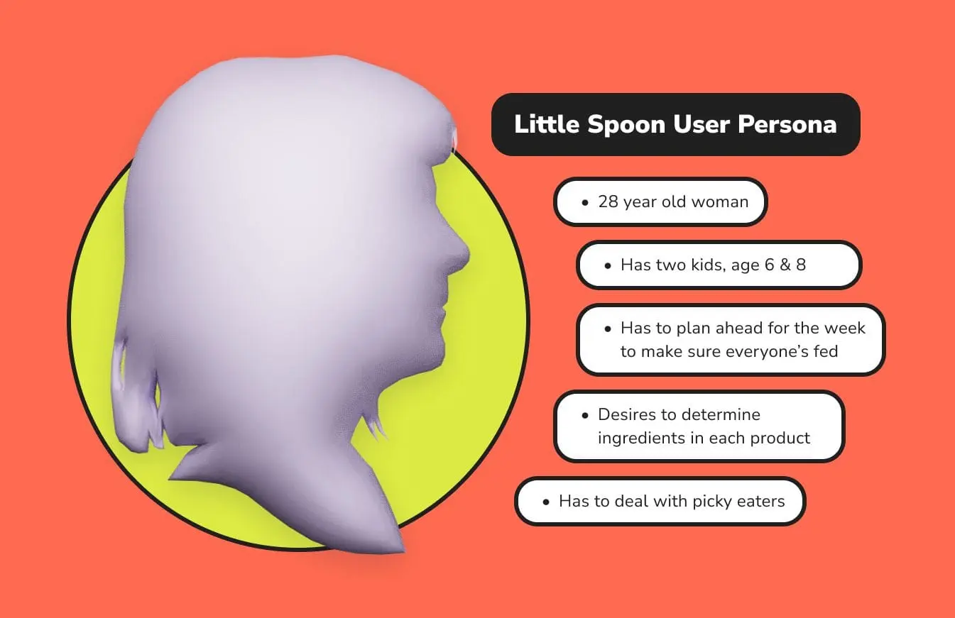
Alongside my introduction to the brand, we ran moderated interviews with parents of young children, asking what frustrated them most about feeding their kids. We also had them work through the current champion page and a competitor’s landing page. That gave us a clear read on what parents actually look for in children’s food, and we built a user persona from it.
Auditing & Inspiration
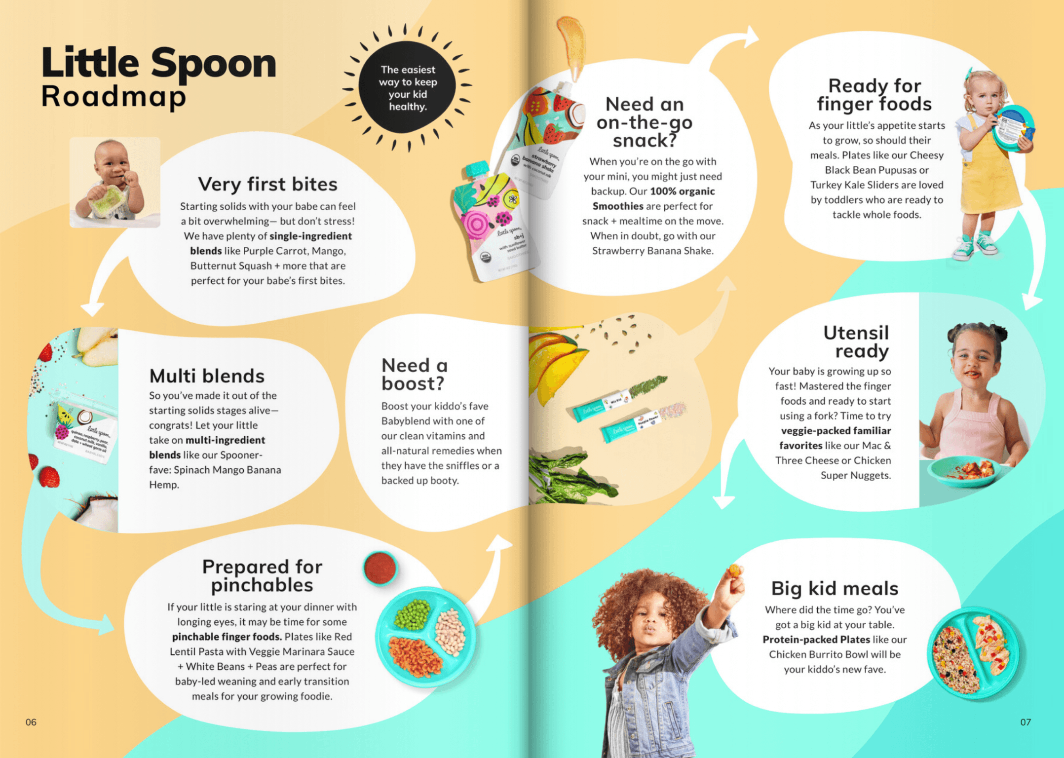
I started by examining the product-specific page running on social and the media split across the product lines, then the brand’s homepage, product galleries, and overall user flows. The brand also gave us a product booklet with a spread laying out the “roadmap” of a child’s progression through their age-specific options.
During the audit I noticed the main site broke products up by age range, particularly the baby blends, which have beginning and intermediary stages. That detail drove a later design decision: adding a step between the blends and plates tabs for later-stage blended food alongside smaller-bite plated meals.
Mock Development
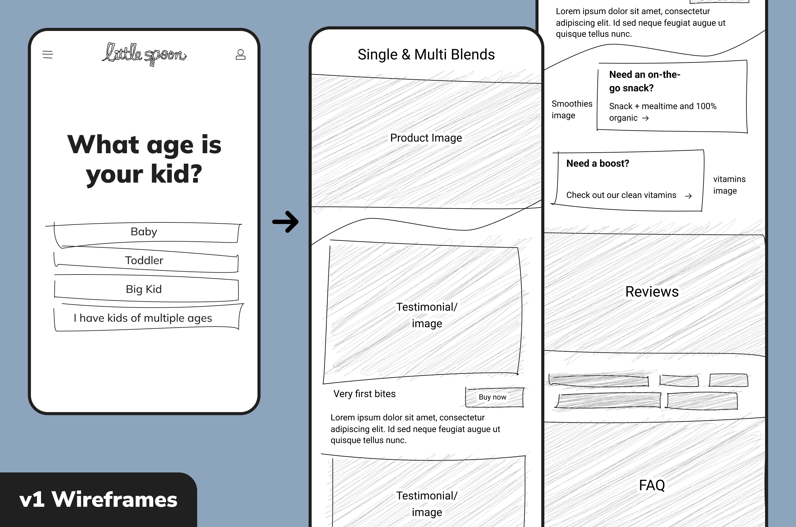
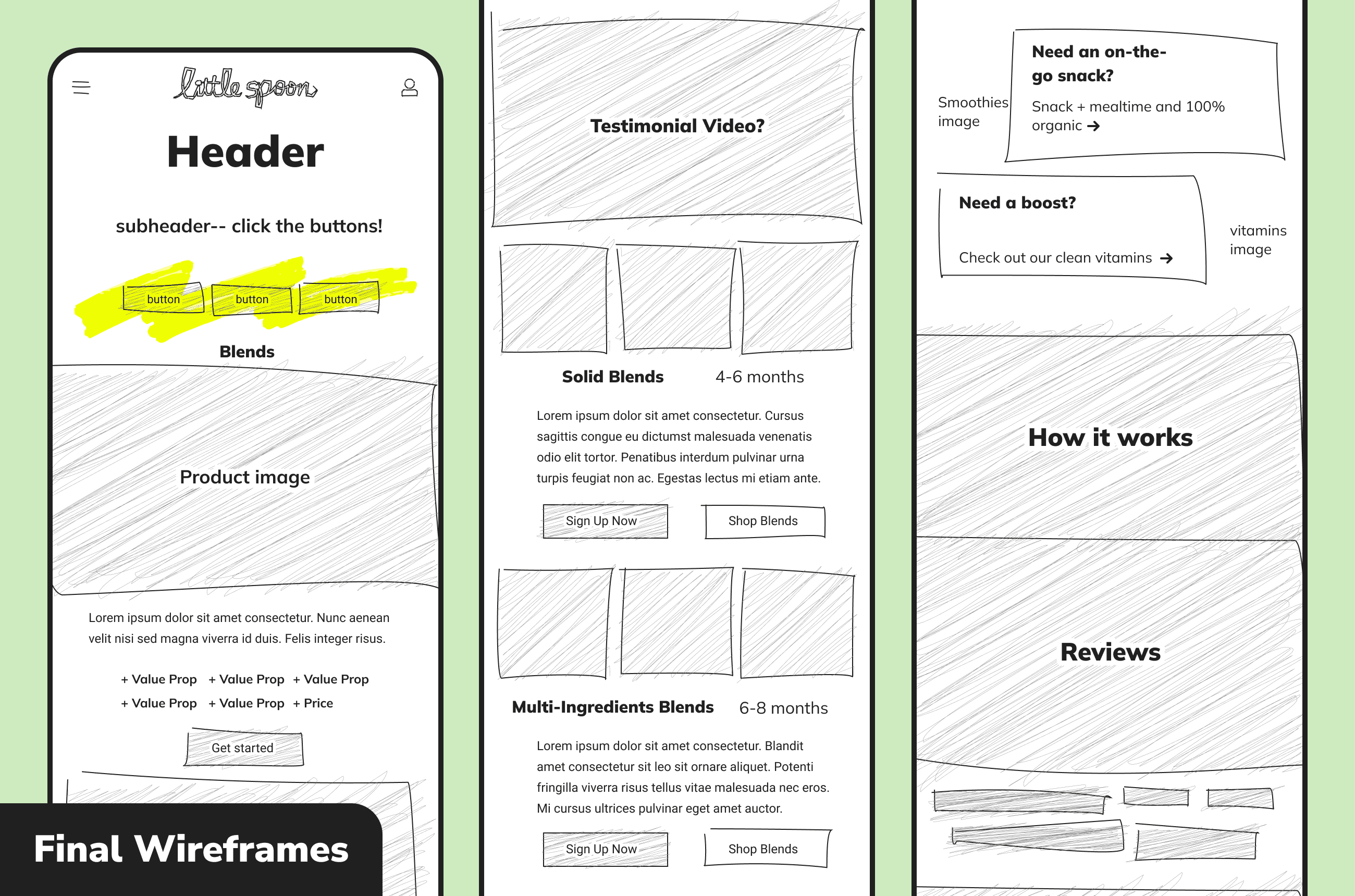
With the concept settled I moved to loose wireframes. The first iteration used a full-screen quiz that diverted users to a product-specific page, but feedback raised the risk of drop-off, so the second put the interactive element on the page itself — which became the final direction. From there I iterated on layout, hero imagery, and the interaction elements until we had a first version worth testing.
Handoff went cleanly. Our engineers wired up dynamic loading keyed to the ad campaign’s UTM, so users land on a version of the page that matches the ad they clicked.
results
For the first test the previous champion — a product-focused landing page for the plates line — acted as control. The new page increased conversion rate 15.5% and brought cost per acquisition down 20%.
Rolling it out to the baby blends funnel against that line’s own product-focused page as control, it won again, this time with a 23.7% increase in conversion rate.
The page held as champion for roughly a year.