Bonafide Revaree CRO


overview
Bonafide, a women’s health brand focused on menopause and the treatment of menopausal symptoms, hired Ampush (later acquired by Tinuiti) as their growth marketing agency in Q3 of 2022. Of their six products, only one — Revaree — takes the majority of the spending budget on social platforms. When the relationship started, Revaree had a 5.2% add to cart rate against a 1.9% conversion rate: intent to purchase clearly existed, but users were falling off somewhere between adding to cart and checking out.
Using conversion rate as our measure of success, the team and I prioritised product detail pages and flows that reduced friction at each step. From 2022 onward I created a series of PDP designs that iterated off A:B tests, the original page acting as control for the first test and each winner becoming the control for the next. Those tests compounded into a 36% increase in conversion rate over the course of the relationship, and each winning pattern was rolled out to other products in the Bonafide line, lifting the account as a whole.

execution
User Testing
User testing runs more or less continuously on Bonafide’s Revaree PDPs — user interviews, competitor analysis, and click and scroll event tracking.
At the start of the relationship in Q4 2022, and again in Q3 2023 and Q1 2024, we prioritised moderated and unmoderated interviews — first on the original page, later on our winning variant — to surface how users thought about the product and about menopause generally, where the existing site frustrated them, and how competitor PDPs handled the same problems.
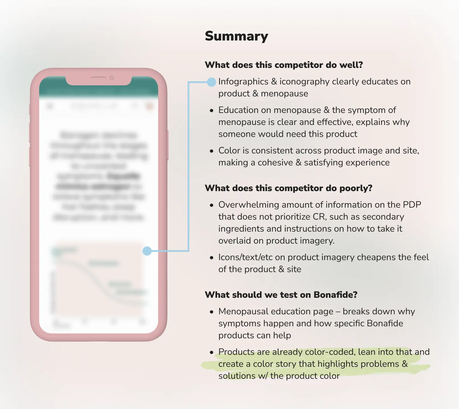
Alongside those interviews I ran whiteboarding and innovation syncs with product managers, account analysts, and other UI/UX designers, working through the landing and product pages of competing brands to identify the UI patterns the market had converged on.
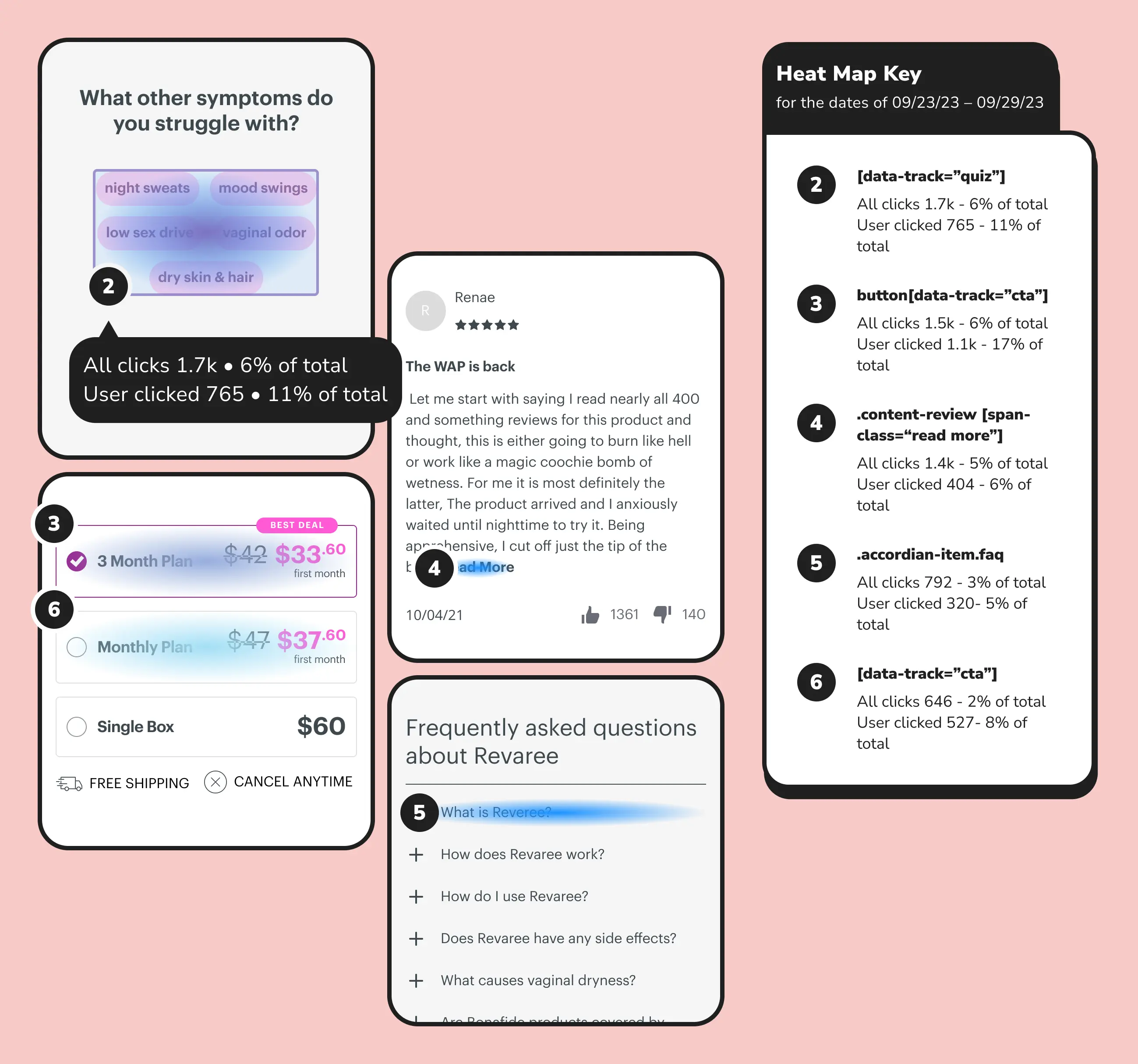
Using FullStory, we regularly create heat maps and scroll maps to find where users interact and where they stall. Most interaction clusters around product information, testimonials, and cross-sell modules. That told us a great deal — most usefully that users were opening review “read more” links in volume, particularly on negative or striking reviews. We recommended sorting reviews by most liked rather than most recent, which produced a lift across the account.
From that research we built a Bonafide user persona to frame our point of view. A large share of users arrive wanting to know exactly what is in the product, which pushed ingredient information forward in every subsequent design. Other insights included:
- A heavy distrust of hormonal treatments among the users we interviewed
- Strong interest in the product’s ingredients
- A clear desire for social proof
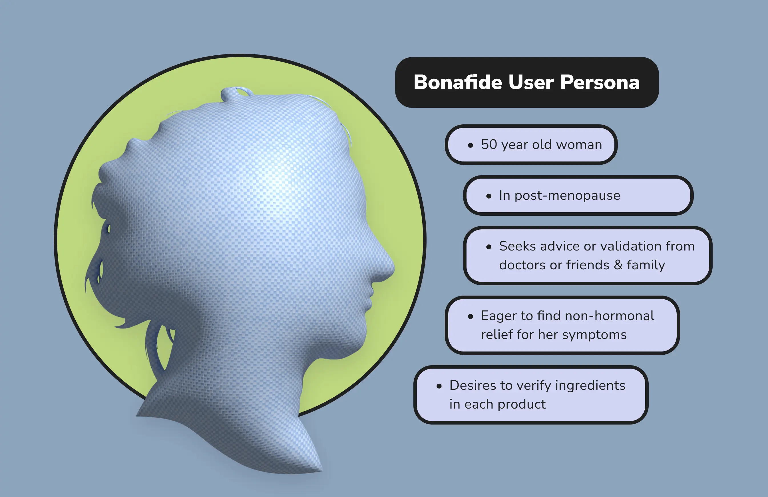
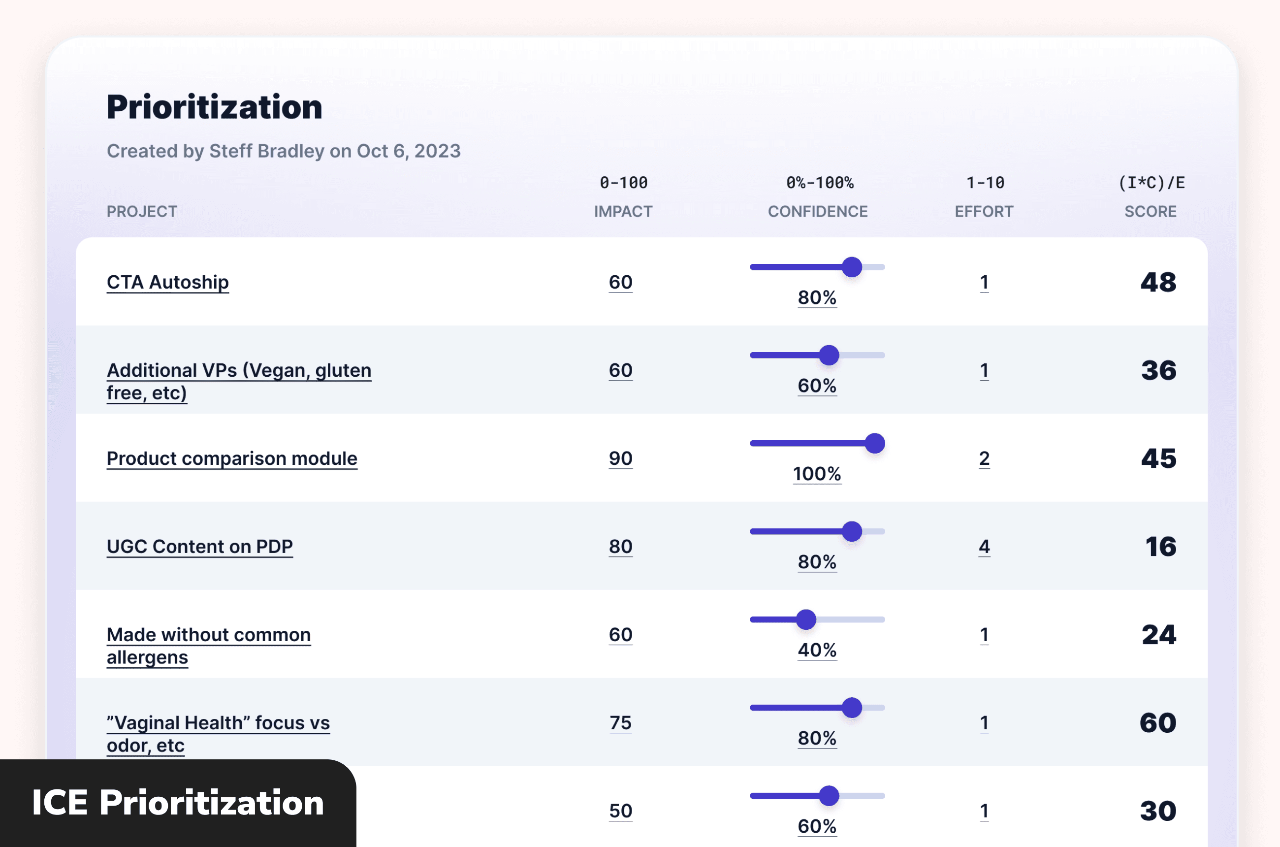
We then prioritised ideas from the research and competitive analysis into a roadmap, rebuilding it each quarter and reprioritising or backlogging as things shifted.
Auditing & Iteration
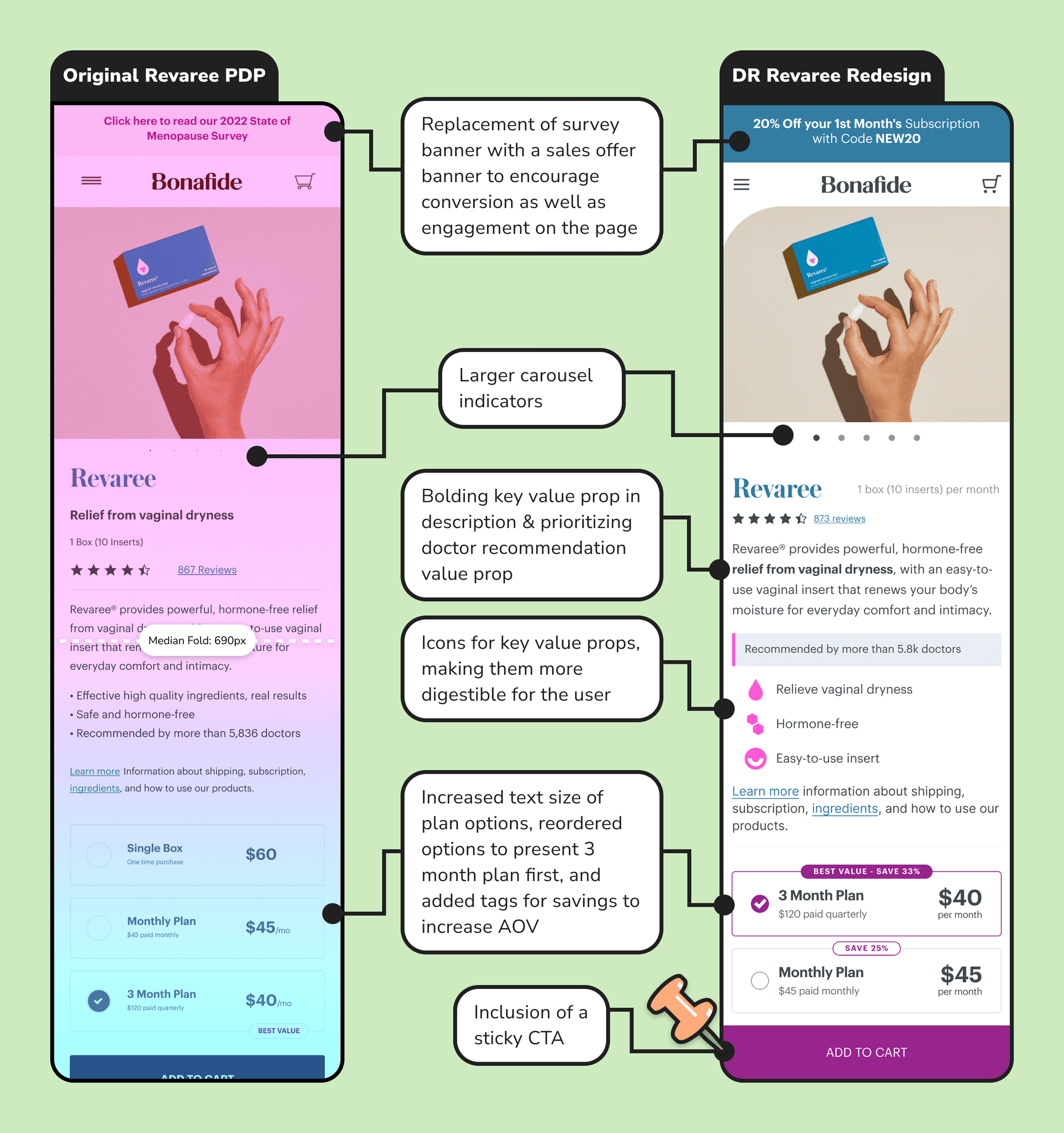
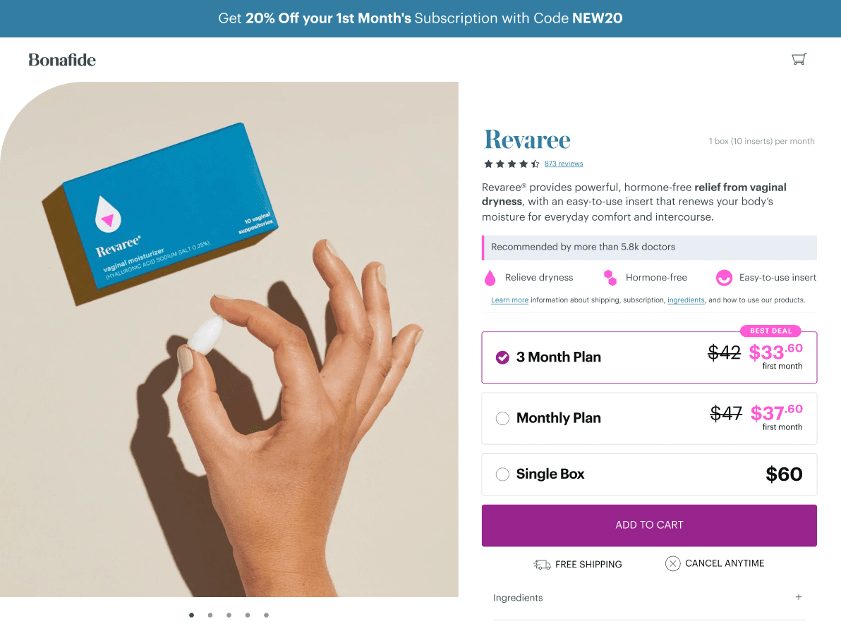
My responding design addressed the friction we had found and put informational, destigmatising product features first, adding a sticky CTA to carry users down the funnel. I highlighted the product’s key features with branded iconography, surfaced the number of doctor recommendations, and worked Bonafide’s branding through the page properly.
Other changes included an auto-scrolling hero carousel, larger type in the subscription module for an audience that skews older, and clearer instructions on how the product works. Consolidating some sections made for a shorter page overall. Run as an even split against the original, this redesign showed an 82% increase in add to cart rate over the control.
One Question Quiz
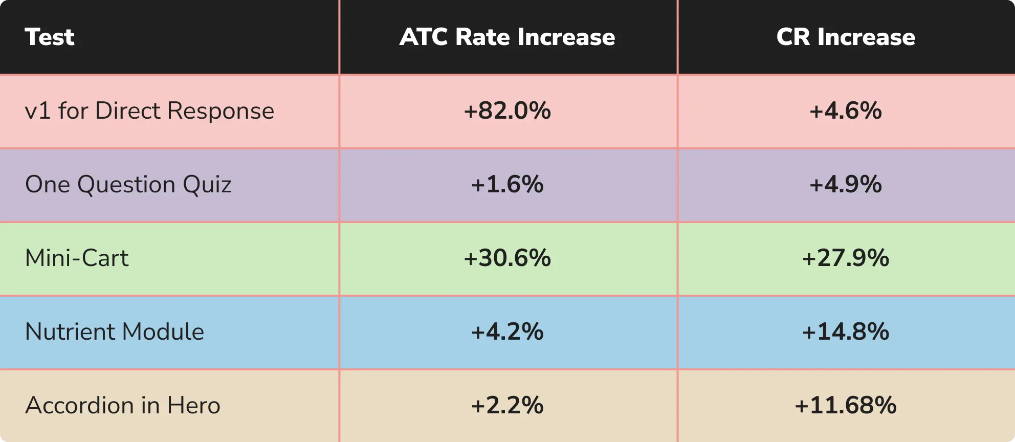
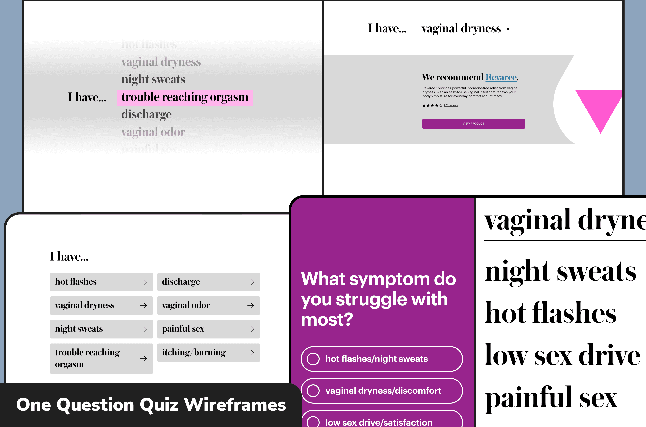
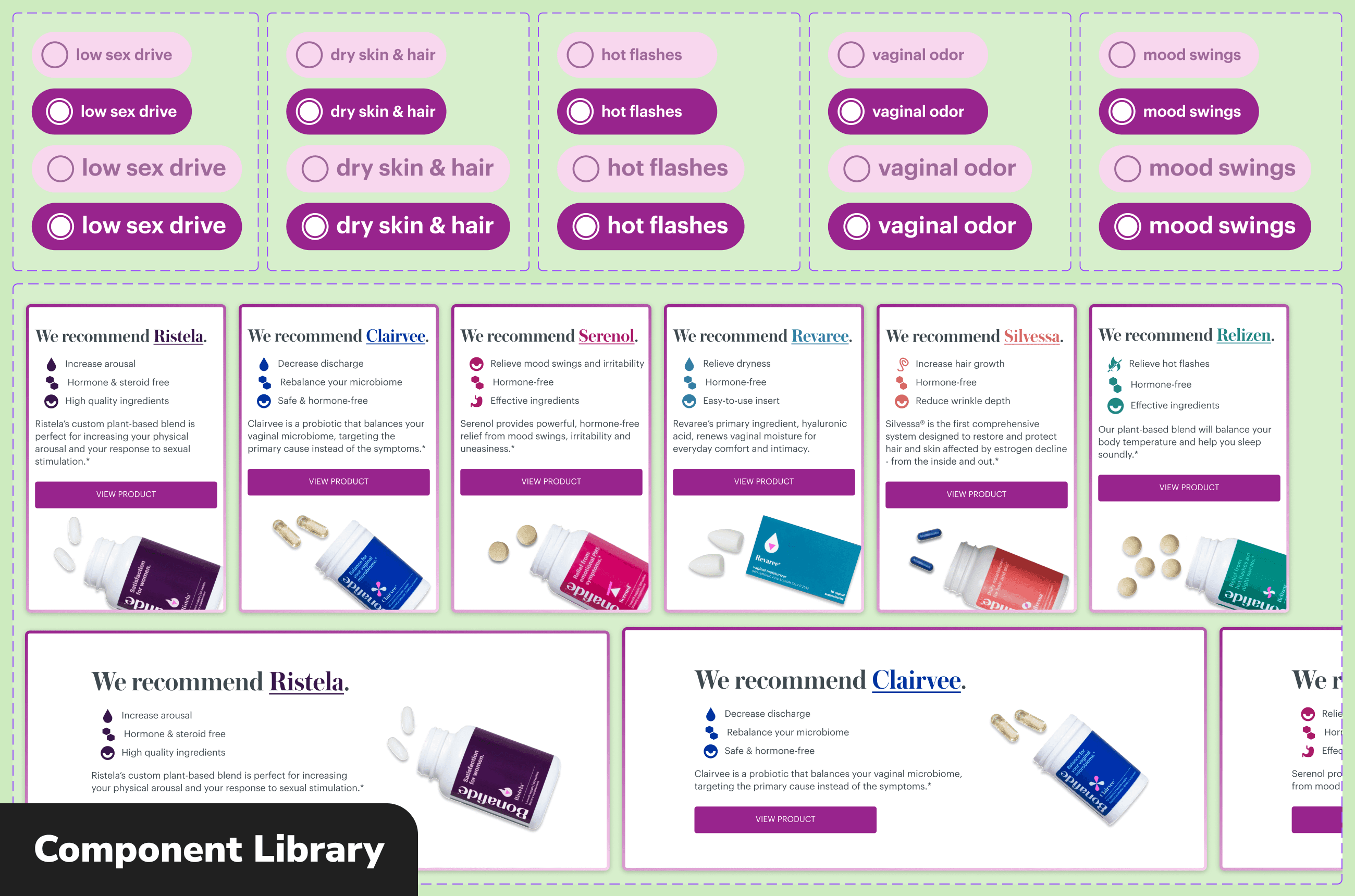
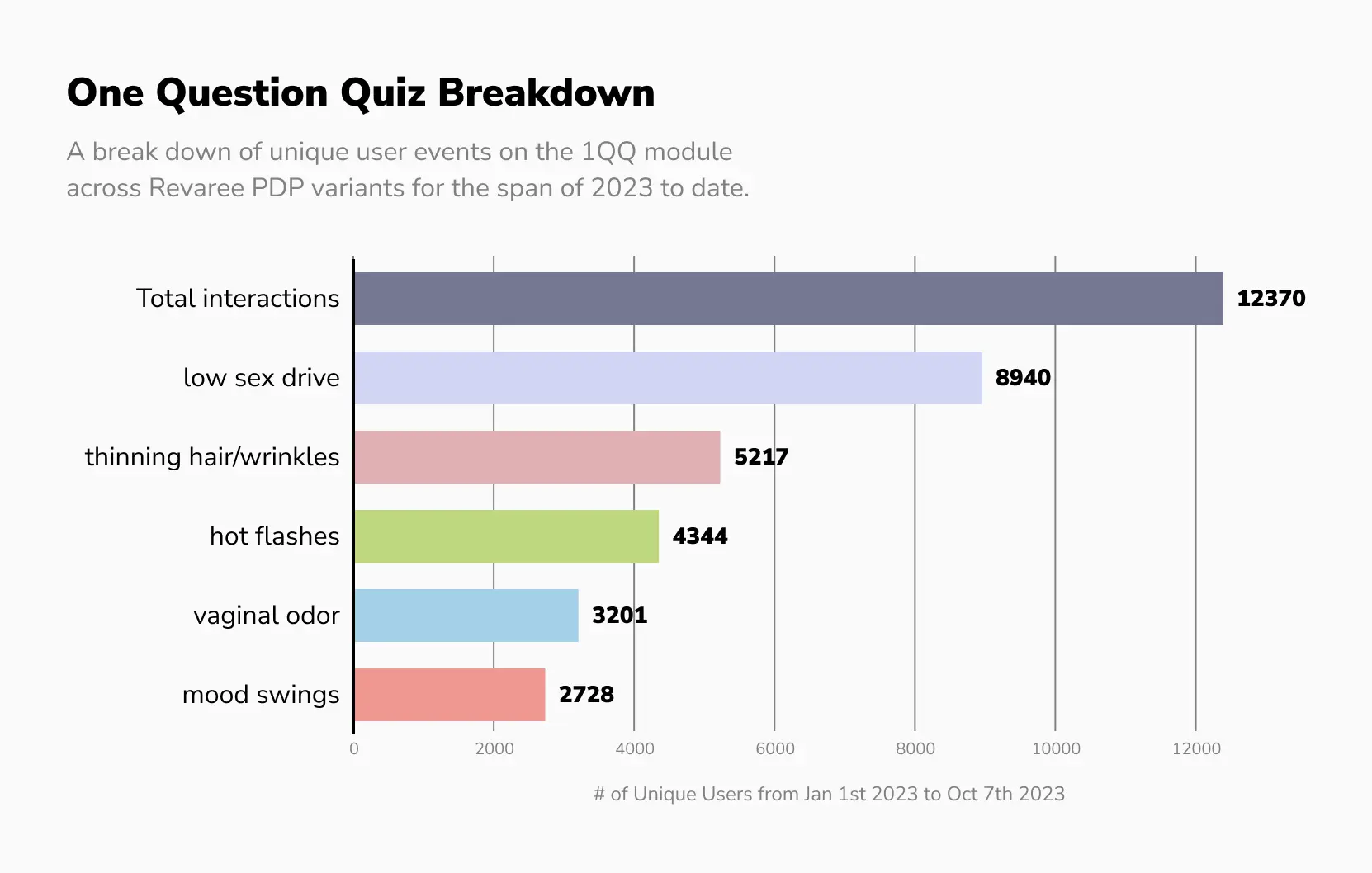
Our first test after the initial redesign introduced a “one question quiz” — a module surfacing alternative products. We hypothesised that a user might click a Revaree ad that spoke to them and still be more likely to convert on something else in the line. It increased conversion rate by 4.9% over the control.
The quiz also gave us a read on cross-sell and bundling opportunities. Ristela, which treats low sex drive, turned out to have the strongest relevance based on how users answered.
Nutrient Module
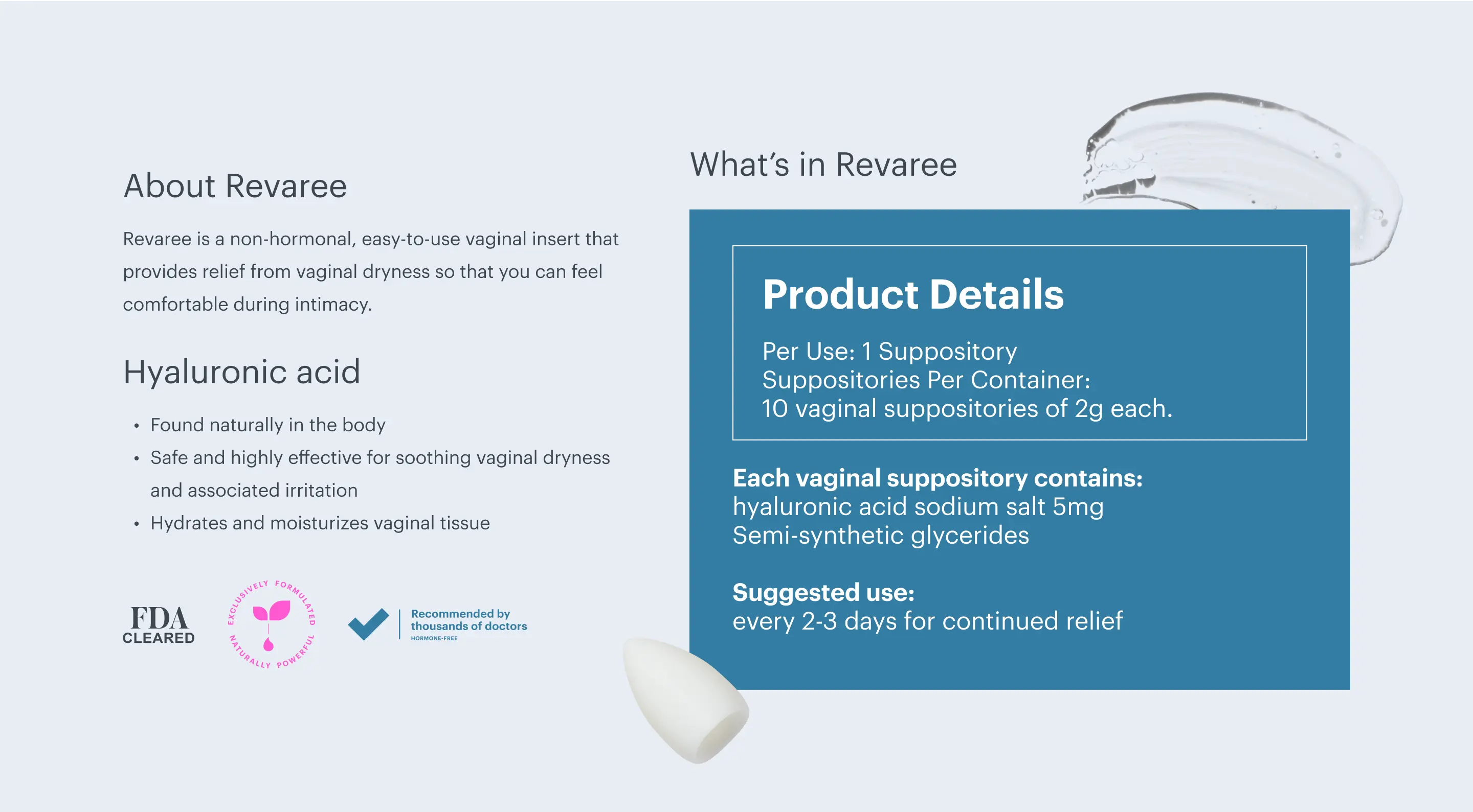
A more recent test rebuilt the nutrient label as a page element, prioritised because heat maps showed users repeatedly trying to click the last carousel image to enlarge the label. The module covers the active ingredient — hyaluronic acid — alongside badges for the product being FDA-cleared, naturally formulated, and recommended by thousands of doctors. It increased conversion rate by 14.8%.
results
The initial post-audit test, split 50:50 against the original Bonafide page, produced an 82% increase in add to cart rate. Conversion rate moved only 4.6%, though, so the gap between wanting the product and buying it was still open — which set the direction for everything after.
Adding the interactive cross-sell closed some of it, lifting conversion rate a further 4.9% over the previous winner. The nutrient section — detailing nutrient content, suggested use, and the active ingredient — added 14.8% over its control.